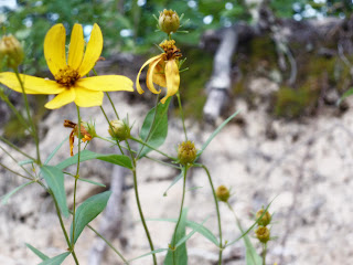
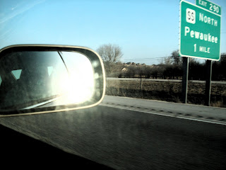
 Both of these pictures are examples of a filtered background. I really like the way each turned out and really make the main idea pop. The first picture with the car mirror has dark brush strokes for the background. I also made the lighting for the mirror a little bit lighter. For the second picture of the flowers, I used accented edges in the background to make it a lot lighter because it originally is a light brown.
