Wednesday, June 9, 2010
Dance
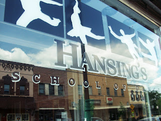
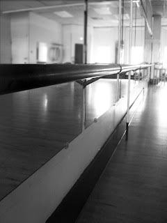 These are part of my self portraits. I like to dance and I have been for a while. I really like the reflection in the first picture. To edit it, I changed the curves and the contrast to make the colors more bold. In the second picture, it is of the mirrors and ballet bar in the Hansings studio. I really like the lighting of it. To edit, i changed the picture to black and white, blurred some thigns in the background, and changed the contrast.
Tuesday, June 1, 2010
Lyrics
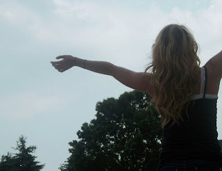 Here is my frist song lyrics picture. To edit this I made the sky more blue and I changed the contrast and brightness. This picture represents the song, "The Great Escape" By Boys Like Girls. I chose this song because it talks about being free and not worrying about things. To show this I thought having the model open her arms to the sky represented the song well. The part of the song that I thought worked is when they say,
Throw it away, forget yesterday, we'll make the great escape. We won't hear a word they say. They don't know us anyway , watch it burn, let it die cause we are finally free tonight.
To edit this, I changed the curves and contrast to change the color. I also changed brightness to help her eyes pop out. This picture represents the song "You're Not Sorry" By Taylor Swift. I chose this song because the lyrics are strong and easy to understand. The model has a content look to her face but her eyes have a sorrow to them. She has had her heart broken by the same guy over and over, but will no longer put up with it. The part of the song I chose to use is in the beginning when she says,
All this time I was wasting hoping you would come around, I've been giving out chances every time and all you do is let me down, and it's taking me this long baby but I figured you out and you're thinking we'll be fine again but not this time around.
Friday, May 21, 2010
Portraits
 This portrait isn't really any of the examples from the website. It could be an up close image but you can see her whole face. I like this picture because of all the colors in it. To edit this, i blurred the background to make the model stand out more. I also changed the contrast and brightness a little bit to make her eyes stand out.
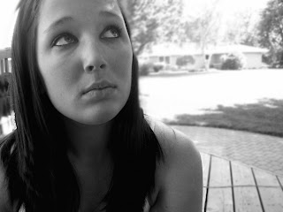 This portrait is an up close image, but also a capture the moment. It is closer to her face but she is outside and content, just thinking. To edit this, I changed the contrast a little bit and then made it in black and white. I think that there is a lot of emotion in this picture. The model has a calm feeling to her.
Tuesday, May 18, 2010
Monday, May 17, 2010
Sharpen Tutorial
Friday, May 14, 2010
Yellow Wallpaper
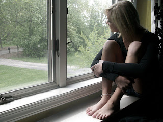 This is my yellow wallpaper picture. In the story, the main charcter who is writing the story talks about feeling alone a lot and looking out her window. To show an alone feeling, I had the model just sit in the ledge of window looking out, almost feeling trapped inside. The color of the wall was originally blue, but i altered it and made it yellow since the main character also talks about her yellow wallpaper.
Color
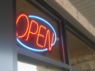 For this color picture, I used a neon open sign. Neon colors are usually used for business to attract customers and advertise. I blurred the background a little bit to draw attention to the open sign.
 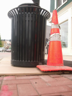 For my next color picture, I used a construction cone. The bright orange color is widely used to show construction is taking place and when people see it, they know there is construction going on. To edit this I blured the background to make the cone more bold and to draw the eye away from the black garbage can.
 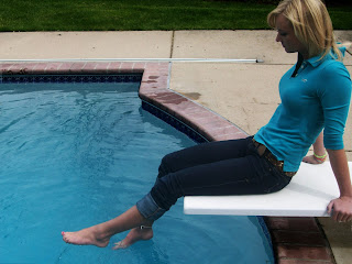 This is my first color picture. Blue usually represents a calm feeling or also depressed and alone. Those are the moods I am trying to show in this photo. I had the model wear a shirt to match the water to make the blue stand out more. Before I edited it, the picture was a little washed out so I changed the contrast and darkened it to look rainy outside to help give the sad mood.
Friday, May 7, 2010
Repulsive #2
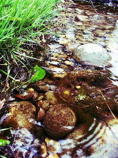
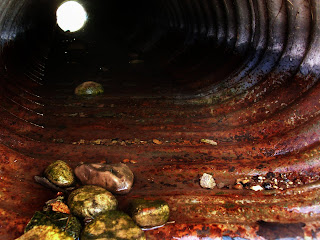 This is my second repulsive picture. It's of the ditch under my driveway. The way the light is shining through in the back from the other side is pretty cool, but with all the rust and dirty rocks, this is repulsive. The original picture was really light and faded looking, so I burned parts of the picture to make it look darker and I changed the contrast.
Repulsive #1
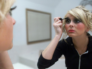 This is my first repulsive picture. In this, the model is looking in the mirror and applying make up. Her expression on her face is kind of disgusted and bored of having to put on so much. It is repulsive because for a lot of girls they are naturally beautiful, but to feel pretty they put on a lot of make up. Too much make up can be gross and make a girl look fake. That is what I am trying to express in this picture. To edit this, I had to get rid of some things by clone stamping and i had to blure the background to draw the eye away from the window.
Attractive #2
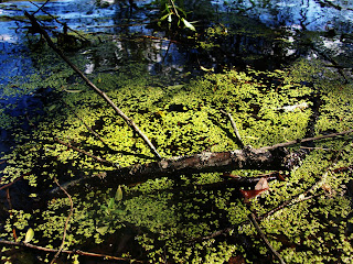 This is my second attractive picture. It's a picture of the pond by my house. Normally, this would be kind of gross to see because of all the scum and garbage in it. Since the colors are really bold and a lot of texture is present, I made this one of my attractive pictures. I had to change the contrast on this and burn the edges to enhance to colors. My favorite part of this are the reflections on the water in the back.
Thursday, May 6, 2010
Attractive #1
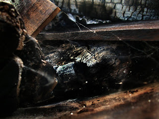 This is my first attractive picture. It is a picture of my bonfire pit outside. It has a bunch of burned and rotten wood and cob webs, so it would normally be something repulsive. To make this picture attractive I changed the contrast to make the wood stand out more. Then I burned the picture to make some parts of it darker and make the picture more clear looking. Overall, I think it turned out pretty cool.
Tuesday, May 4, 2010
Neon Glow
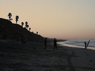
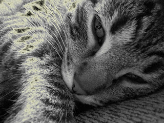 These are my neon glow examples. I really like the neon glow effect. I think it adds softness to a picture, but still makes things pop. For both of them I just set the picture to neon glow then picked the color of the glow and used the overlay setting. I was able to pick the amount of glow used and how strong it is too.
Monday, May 3, 2010
Easy Blur
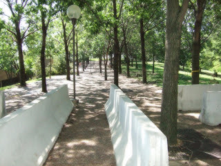
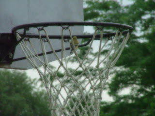
These two pictures are examples of the easy blur effect. To maket his effect, all I had to do was blur the photo with a gaussian blur just enough so the details are still visible. Then I had to change the opacity so the blur isnt as strong. This is an easy effect, but still softens pictures well and makes them look good. You can't really see the blur as much in my first photo, but the second is easier.
Friday, April 30, 2010
Filtered Background
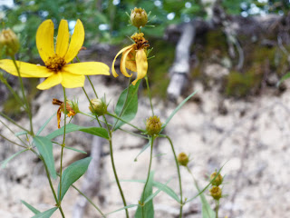
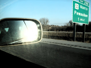 Both of these pictures are examples of a filtered background. I really like the way each turned out and really make the main idea pop. The first picture with the car mirror has dark brush strokes for the background. I also made the lighting for the mirror a little bit lighter. For the second picture of the flowers, I used accented edges in the background to make it a lot lighter because it originally is a light brown.
Friday, April 23, 2010
Alphabet
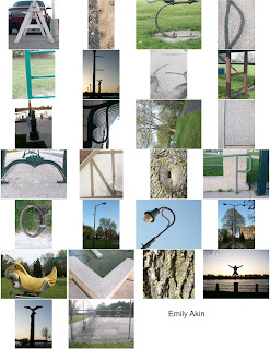
My overall theme for the alphabet was nature. This project was pretty fun, but it was hard to find some of the letters. Looking at some of them at first, they aren't very noticeable, but once they are all on the contact sheet, they are much easier to see. I think i did pretty good, but I could have done a better job with some of them.
Space
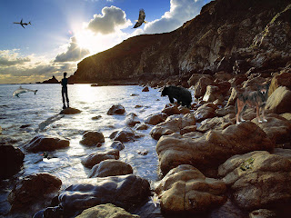
For my space picture I used an outdoor background. I added a bunch of different things I though fit in with it. Some of the things aren't very spaced well and sized wrong. The dolphin and the eagle could probably be smaller to make them look more realistic. Otherwise, I feel like I did okay on this assignment. My favorite part is the person standing on the rock. In my opinoin, it looks like it is originally with the background.
Subscribe to:
Comments (Atom)


